How the Mercator Projection Changes the Size of the World
On a Mercator world map, Greenland and Africa look roughly the same size. They aren’t close. Africa covers about 30.37 million km², including its islands, and Greenland about 2.17 million km². Africa is about 14 times larger.
That gap isn’t a drawing mistake. It follows from one rule that the projection applies everywhere, and you can see it for any latitude in our map distortion calculator. This post goes through that rule, what it does to the map most of us picture when we think of “the world”, and why the world map in Globdrop uses a different projection.
One rule: straight meridians, true angles
Every flat map of the globe distorts something. Gauss proved in 1827 that a sphere can’t be laid flat without stretching it (his Theorema Egregium), so each projection chooses what to keep and what to give up. We go through the maths in Six coordinate systems in one geography game.
Gerardus Mercator published his map in 1569 for navigation. On it, a line of constant compass bearing is a straight line, so a navigator could draw a course with a ruler and read off the heading (Snyder, Map Projections: A Working Manual, USGS, 1987).
To get there, Mercator draws the meridians as parallel vertical lines. On the globe they meet at the poles. So at latitude φ, a parallel that is really cos φ times the length of the equator is drawn as long as the equator. The map stretches it east–west by a factor of 1/cos φ, which cartographers write as sec φ.
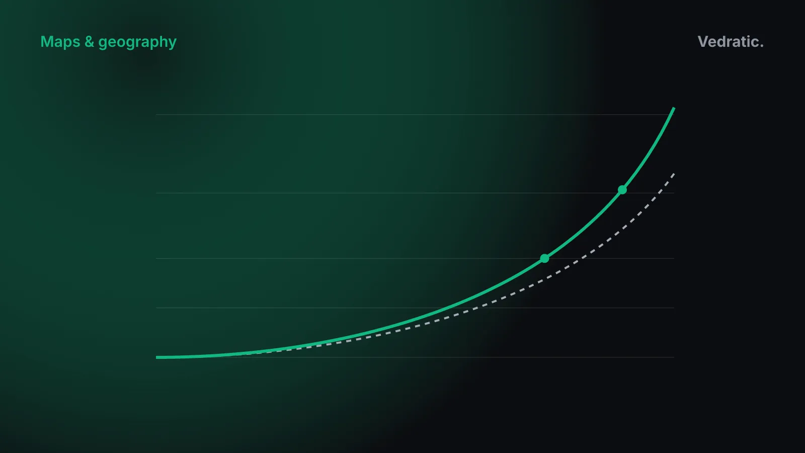
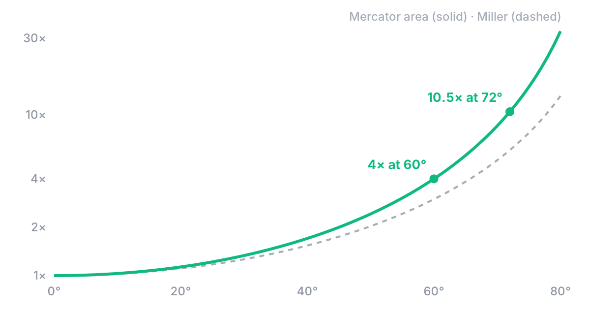
On its own, that stretch would squash every shape sideways. Mercator’s answer is to stretch north–south by the same factor at every latitude. Small shapes then keep their proportions and angles stay true. That property is called conformal. The cost is that both directions grow together, so area grows as sec²φ:
| Latitude | East–west scale | North–south scale | Area vs the equator |
|---|---|---|---|
| 0° | 1 | 1 | 1× |
| 45° | 1.41 | 1.41 | 2× |
| 60° | 2 | 2 | 4× |
| 72° | 3.24 | 3.24 | about 10.5× |
At 60° N, the latitude of Oslo, Helsinki and southern Greenland, every square kilometre is drawn four times as large as the same square kilometre at the equator. Greenland runs from about 59° to 83° N. Take 72° as a middle value and its area is drawn about 10.5 times larger than it would be on the equator. Africa, which straddles the equator, is barely inflated. Divide the 14× real difference by that 10.5× and most of the gap disappears on the map.
The poles themselves never appear. sec φ grows without limit as φ approaches 90°, so a Mercator map always has to be cut off somewhere short of the poles.
Try it in the calculator
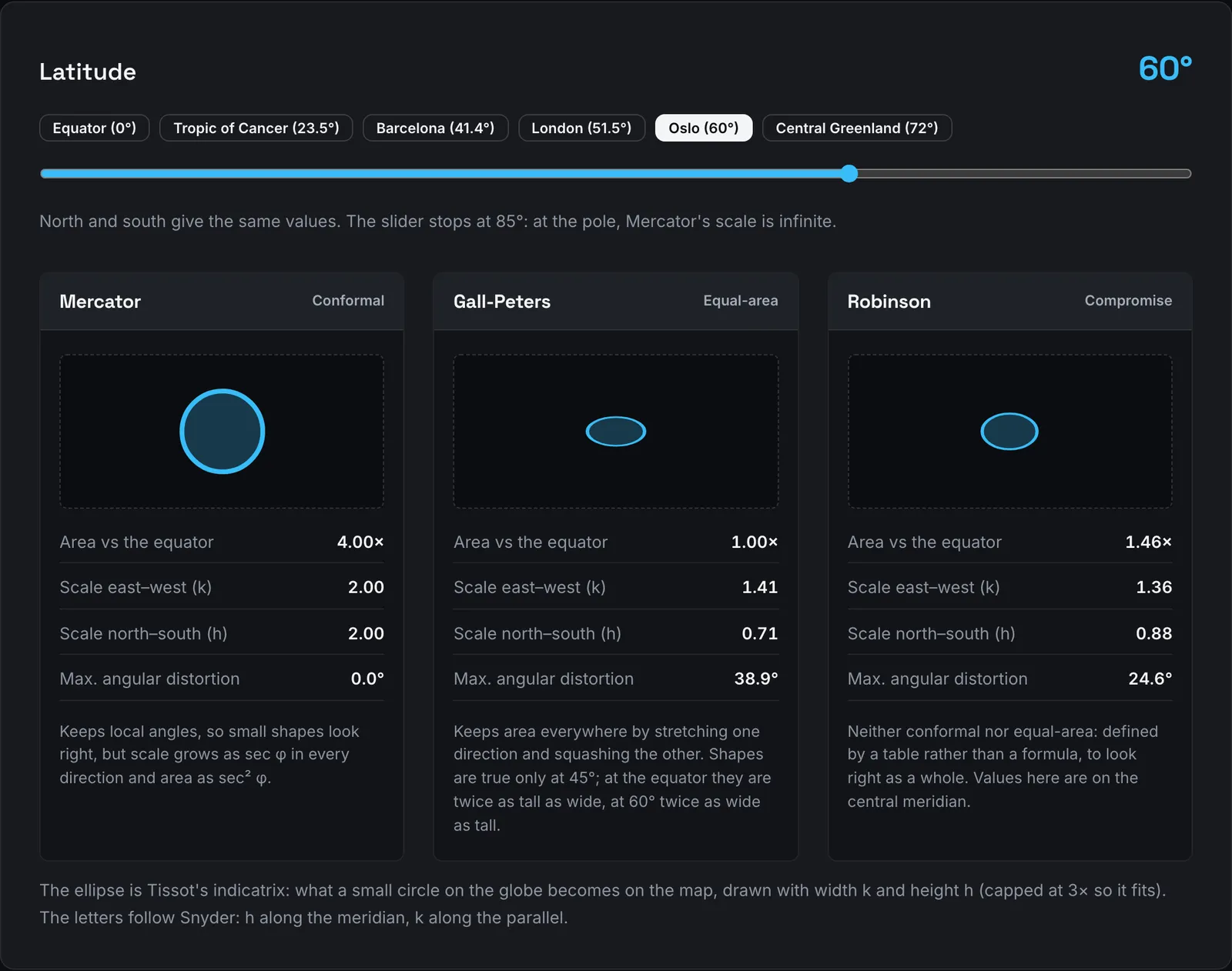
The map distortion calculator shows the same numbers with a latitude slider, for three projections side by side:
- Mercator keeps angles. Its area factor at 72° reads 10.47, the sec²φ above.
- Gall-Peters keeps area. It does that by stretching one direction and squashing the other, so shapes are only true at 45°. At the equator they’re drawn twice as tall as they are wide, and at 60° twice as wide as tall.
- Robinson keeps neither. It was defined by a table rather than a formula, chosen so the world looks about right as a whole.
Move the slider from 0° to 80° and watch the Mercator column. Distortion is small up to about 30°. Beyond 60° it grows fast. The calculator also shows the angular deformation, ω, which stays at zero for Mercator at every latitude. That’s what the whole map was designed for.
What the map does to the picture in your head
Mercator’s map is on classroom walls and, as Web Mercator, it has been the default of many online maps. For many people it is simply what the world looks like. If you learned the world from it, you learned a Canada, a Russia and a Greenland several times bigger than they are compared with Brazil, the Congo basin or Indonesia.
We haven’t found a study that measures how much Mercator itself shapes people’s sense of relative size, so we won’t give a number for that. What has been measured is how memory distorts maps in general. People line up continents that don’t line up, and they straighten borders that aren’t straight. We wrote about those findings, with the papers, in Why your mental map is wrong.
Why Globdrop’s world map uses Miller
Globdrop’s world scenarios (World Capitals, World Volcanoes, Greatest Peaks, Famous Skyscrapers and Sports Stadiums) all use one base image: a public-domain blank world map from Wikimedia Commons, drawn in the Miller cylindrical projection. Osborn Maitland Miller proposed it in 1942 as a softened Mercator (Snyder, above). In the game’s code (src/engine/coordinate-math.ts), the projection is one line:
function latToMillerY(lat: number): number {
  const rad = (lat * Math.PI) / 180;
  return 1.25 * Math.log(Math.tan(Math.PI / 4 + 0.4 * rad));
}
It is Mercator’s formula with the latitude scaled by 0.8 and the result by 1.25. Three things follow from that, and they’re why it suits a click-on-the-map game:
- North is up and meridians are straight. Every column of pixels is one longitude and every row is one latitude. When you click, the game turns the pixel back into a latitude with one inverse formula. It doesn’t need a lookup per region or per face.
- The poles are finite. Miller’s formula gives a finite value at 90°, so the whole globe fits in the image. Globdrop’s world scenarios still crop the top and bottom: the World Capitals bounding box runs from 82.2° N to 66.7° S, which keeps the image for the land people actually get asked about.
- High latitudes are inflated less. Miller isn’t conformal and isn’t equal-area either. It sits in between. Its area factor is sec φ · sec 0.8φ. At 60° that is about 3× instead of Mercator’s 4×, and at 72° about 6× instead of 10.5×.
Miller has a cost, and until September 2026 it showed up in the score. Globdrop used to measure your miss on the image: the distance in pixels between your click and the target, multiplied by one fixed scale for the whole map. On a cylindrical projection that scale can only be right at one latitude. At 60° N, the map draws each kilometre of east–west distance twice as long as at the equator, so an east–west miss near Stockholm counted about double what the same miss counted near Nairobi. Now the game turns your click back into latitude and longitude and measures the distance on the globe, so the stretching only changes how the map looks, not what a miss is worth. Northern capitals still look further apart on screen than they are.
The regional scenarios also use projections suited to each area, so their maps look closer to the real shapes. Capitals of Europe uses a Lambert azimuthal equal-area map centred on 52° N, 10° E. US States uses an Albers equal-area conic. The full list is on the Globdrop page. We also looked at Buckminster Fuller’s Dymaxion map, which distorts area much less than either Mercator or Miller, and explain why it doesn’t fit the game in Why Globdrop doesn’t use the Dymaxion map.
To see how much a given latitude inflates on Mercator, set the slider in the map distortion calculator to your own city’s latitude.