Six coordinate systems in one geography game
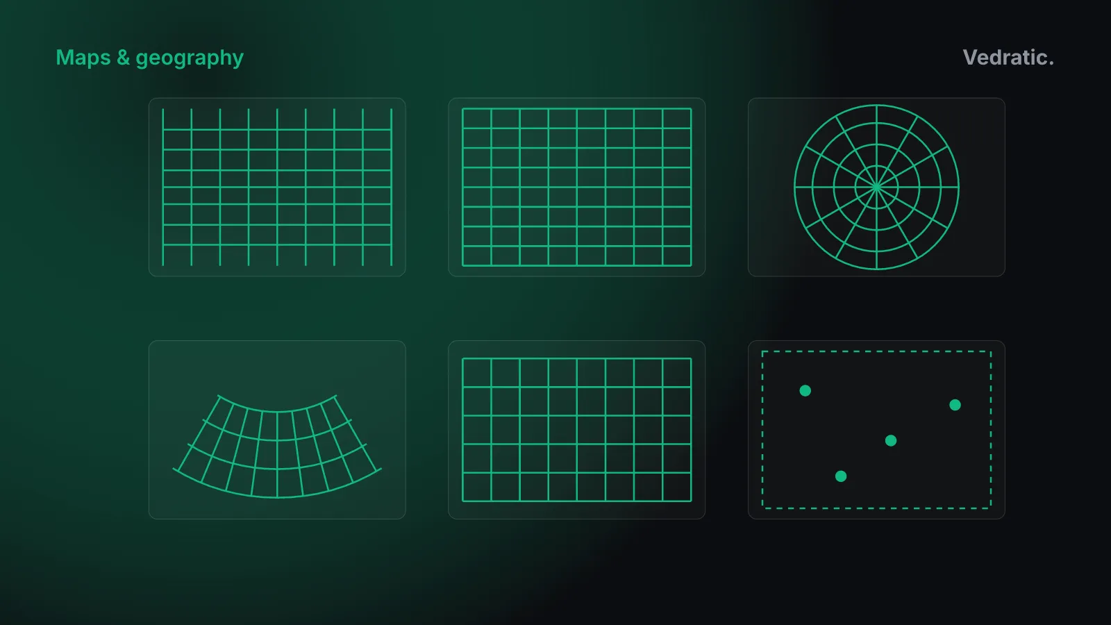
Every map in Globdrop is an image, and every click on it has to become a real position so we can measure how far off it was. The step in between is a map projection run backwards. Globdrop has six coordinate systems for its twelve map scenarios, and this post goes through the maths of each, as it appears in src/engine/coordinate-math.ts.
Why there’s no perfect flat map
A sphere can’t be flattened without stretching it somewhere. This isn’t a limit of technique. It follows from Gauss’s Theorema Egregium: the curvature of a surface is intrinsic, it can be measured from distances on the surface alone, and bending without stretching can’t change it. A sphere has positive curvature everywhere and a plane has zero, so any flat map of the Earth distorts distances somewhere.
Each projection chooses what to keep. A conformal projection keeps angles, so small shapes look right, at the cost of area. An equal-area projection keeps area, at the cost of shape. No projection can be both. Others keep true distances from one point, or true directions from one point, or keep nothing exactly and try to spread the error. The standard reference for the formulas below is John P. Snyder’s Map Projections: A Working Manual (USGS Professional Paper 1395, 1987), which gives forward and inverse equations for each.
A common mental model sorts projections by the surface you’d “unroll”: a cylinder around the Equator, a cone over a pole, or a plane touching the globe at one point. Most useful projections aren’t literal shadows cast on those surfaces, but the families are named after them, and Globdrop has one of each.
The six systems
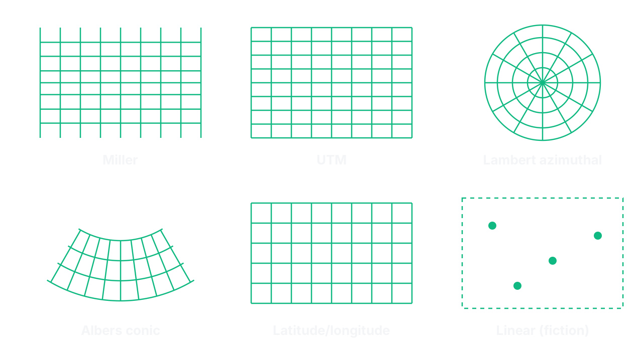
| System | Family | Keeps | Globdrop scenarios |
|---|---|---|---|
Mercator (labelled WGS84 in the code) | Cylindrical | Angles | Ancient wonders |
| Miller | Cylindrical | Nothing exactly | Five world scenarios |
Lambert azimuthal equal-area (LAEA) | Azimuthal | Area | Capitals of Europe |
Albers equal-area conic (AlbersUSA) | Conic | Area | US States |
| UTM | Transverse cylindrical, per zone | Angles | Municipalities of Catalonia |
| Linear | None: a flat grid | Whatever the artist drew | Middle-earth, Westeros, One Piece |
In each case the game projects the point and the two corners of the map’s bounding box into the same plane, then interpolates between the corners. To go from a click back to a place it does the reverse: it interpolates in the projected plane and applies the inverse formula. So every system needs both directions.
Mercator
In Globdrop, WGS84 means the scenario’s coordinates are plain longitude and latitude. The image is assumed to be Mercator. Longitude maps linearly to x, and latitude goes through the Mercator formula:
function latToY(lat: number): number {
  return Math.log(Math.tan(Math.PI / 4 + (lat * Math.PI) / 180 / 2));
}

function yToLat(y: number): number {
  return (2 * Math.atan(Math.exp(y)) - Math.PI / 2) * 180 / Math.PI;
}
That’s y = ln(tan(π/4 + φ/2)), with R = 1 because the game only needs ratios. It’s conformal: the north–south scale grows as sec φ, the same as the east–west scale, so angles are kept. As φ approaches 90°, tan goes to infinity and so does y, so a Mercator map can never show the poles. At 60° the linear scale is 2× and the area scale 4×. You can check any latitude in our map distortion calculator.
The ancient wonders scenario converts your click back to latitude and longitude and uses the haversine formula for the great-circle distance. Since September 2026 every map of the real world does the same with its own inverse projection, which is why the inverses below matter: they’re what turns a click into a distance. Before, only this map did, and the rest measured on the image with one scale, which on the world maps was about 30% short at the Equator. Calibrating a map image has the numbers.
Miller
The world maps use Miller’s cylindrical projection, which Snyder describes as a modified Mercator. It scales the latitude by 0.8 before applying the Mercator formula, then divides the result by 0.8. That keeps the poles at a finite distance, and the price is that the projection is neither conformal nor equal-area.
function latToMillerY(lat: number): number {
  const rad = (lat * Math.PI) / 180;
  return 1.25 * Math.log(Math.tan(Math.PI / 4 + 0.4 * rad));
}

function millerYToLat(y: number): number {
  const rad = 2.5 * (Math.atan(Math.exp(0.8 * y)) - Math.PI / 4);
  return (rad * 180) / Math.PI;
}
The inverse falls straight out of the forward formula: divide by 1.25, undo the logarithm and the tangent, and divide the angle by 0.4 (which is the same as multiplying by 2.5). We use Miller because the base image is a Miller map. Its file name says so.
Lambert azimuthal equal-area
Europe is drawn on a Lambert azimuthal equal-area projection centred on 52° N, 10° E. That’s the same centre as the EU’s ETRS89-LAEA grid (EPSG:3035). In the spherical form Globdrop uses:
const k = Math.sqrt(2 / (1 + Math.sin(lat0) * sinPhi + Math.cos(lat0) * cosPhi * cosLambdaDiff));

return {
  x: k * cosPhi * sinLambdaDiff,
  y: k * (Math.cos(lat0) * sinPhi - Math.sin(lat0) * cosPhi * cosLambdaDiff)
};
The inverse goes through ρ, the distance from the centre on the plane, and c, the angular distance on the sphere, with c = 2 · asin(ρ / 2):
const rho = Math.sqrt(x * x + y * y);
if (rho === 0) return { x: lon0Deg, y: lat0Deg };

const c = 2 * Math.asin(rho / 2);
const cosC = Math.cos(c);
const sinC = Math.sin(c);

const lat = Math.asin(cosC * Math.sin(lat0) + (y * sinC * Math.cos(lat0)) / rho) * 180 / Math.PI;
const lon = (lon0 + Math.atan2(x * sinC, rho * Math.cos(lat0) * cosC - y * Math.sin(lat0) * sinC)) * 180 / Math.PI;
The rho === 0 guard handles a click exactly on the centre, where the formula would divide by zero. Like every azimuthal projection, this one keeps true directions from the centre. What it adds is equal area, which suits a map where you compare the sizes of countries.
The code also knows a LAEA-USA variant, centred on 45° N, 100° W. No scenario uses it: the US map has used Albers since it was added.
Albers equal-area conic
The US map uses an Albers equal-area conic with standard parallels at 29.5° N and 45.5° N. Those are the parallels Snyder gives as the usual choice for maps of the conterminous United States. The forward formula works with a cone constant n and a radius ρ per latitude:
const n = (Math.sin(phi1) + Math.sin(phi2)) / 2;
const C = Math.cos(phi1) * Math.cos(phi1) + 2 * n * Math.sin(phi1);
const rho0 = Math.sqrt(C - 2 * n * Math.sin(phi0)) / n;

const rho = Math.sqrt(C - 2 * n * Math.sin(phi)) / n;
const theta = n * (lambda - lambda0);
The inverse recovers ρ and θ from x and y, then solves C − ρ²n² = 2n · sin φ for the latitude and λ = λ0 + θ/n for the longitude.
One discrepancy is worth writing down. The comment above the function gives a central meridian of 96° W and a latitude of origin of 37.5° N. The constants in the code are 98.5° W and 38° N. The game uses the same constants in both directions, so it’s consistent with itself, and the bounding box was calibrated with those constants. We don’t know which parameters were used to draw us.svg, so we can’t say which set matches the image better.
On us.svg, Alaska and Hawaii are drawn as insets. Their “coordinates” in usa-states.json aren’t their real ones. They’re points picked to land on the insets: Juneau is stored at 112.4° W, 25.8° N.
UTM, and a flat grid
The Catalonia scenario stores positions as UTM eastings and northings in metres. Barcelona is at 430,743 E and 4,583,711 N. The file doesn’t name the zone, but those values only fit zone 31 north. UTM is a transverse Mercator projection per 6° zone, and inside one zone the plane is close enough to the ground that the game treats it as flat. The UTM branch is linear interpolation, and distance is pixel distance scaled to metres.
The fictional maps use the same linear branch with invented units: 0 to 1,000 on both axes for Middle-earth and Westeros, and the image’s own pixel size for One Piece. There’s no Earth to project, so the only “projection” is whatever the artist drew.
Compromise projections
Two claims in the earlier version of this post were wrong.
The Winkel tripel projection isn’t pseudocylindrical, and it doesn’t need iterative methods to draw. Oswald Winkel proposed it in 1921 as the arithmetic mean of the equirectangular projection and the Aitoff projection. The forward formula is closed-form. It’s the inverse, going from the map back to latitude and longitude, that has no closed form and needs iteration. National Geographic has used it for world maps since 1998 (Esri’s projection notes cover all of this).
Aviation charts aren’t “almost exclusively” conic either. The Lambert conformal conic is the usual choice for mid-latitude charts, and most US VFR charts use it. Mercator, polar stereographic and other projections are used where they fit better, for example near the poles (Jeppesen’s list of chart projections).
Web Mercator and tiles
Online maps use a spherical Mercator known as Web Mercator (EPSG:3857). It treats the Earth as a sphere for the projection. If you cut it off at the latitude where the map’s height equals its width, which is atan(sinh(π)) ≈ 85.0511°, the world becomes a square.
A square divides cleanly. At zoom level z the world is 2^z × 2^z tiles of 256 × 256 pixels, so 1 tile at zoom 0, 4 at zoom 1 and 16 at zoom 2. Each tile splits into four at the next level, which is why panning and zooming only ever need a few small files (OpenStreetMap’s tile naming scheme documents the numbering). Globdrop doesn’t use tiles at all. How we make a Globdrop map explains why one calibrated image works better for a game.
Where to go next
What the scenarios do with these projections when they measure a miss, including how the world maps’ scale is set, is in Calibrating a map image. How Mercator changes the way we see the world is in Why the Mercator projection distorts our worldview, and why we didn’t pick an unusual projection for the game is in Why Globdrop doesn’t use Dymaxion.