Designing Globdrop's Feedback Loop: The Error Line, the Threshold and the Clock
An earlier version of this post was called “How Geography Games Boost Brain Health”. It promised effects on memory and ageing that nobody has measured for Globdrop, and we have removed them. What we can describe is the part we designed: what the game shows you in the second after you click, and why.
What happens after a click
A map round in Globdrop goes like this, in src/components/ui-renderer.ts:
- A three-second countdown shows the name of the place.
- The map appears with the name in the top bar and a ring timer on the right. The ring turns red in the last three seconds.
- You click once. The map stops taking clicks.
- An orange pin drops where you clicked. 0.3 seconds later a yellow pin drops on the target, and at 0.6 seconds a dashed line is drawn between the two.
- The top bar changes from the place name to your error, for example “412 km to Cairo”.
- A button shows the points for the round and “Next”.
If the clock runs out first, the bar says “You were too slow!” and the round is worth 0.
At the end of a game you get your total, a title from the scenario’s list (World Capitals has its own, and so do the fictional maps), and the sum of all your errors, shown as “unnecessary km”. The how-to-play guide covers the modes and the scenarios.
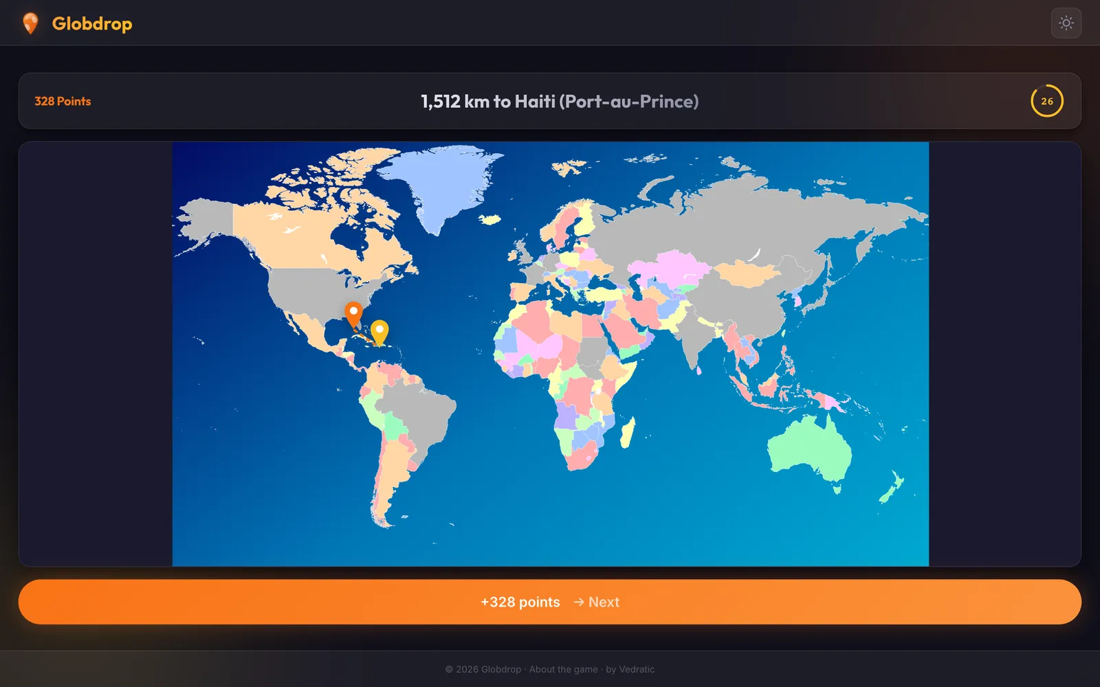
Why a distance and a line, not right or wrong
A quiz that says “wrong” tells you one thing. The feedback we wanted tells you two:
- How far off you were. The number in the top bar. 40 km off Cairo and 1,400 km off Cairo are both misses, but they are very different misses.
- Which way you were off. The dashed line. If you put Cairo in the middle of the Sinai, the line points west. The next time Egypt comes up, you have a direction to correct in, not just a fact to memorise.
That’s why the line and the distance are shown on every click, including clicks that score nothing. A miss beyond the threshold is worth 0 points, but it still gets the full feedback.
The maps have no place names on them. That’s what makes the round a memory exercise and not a reading one. They do show borders, though: the world map is coloured by country, the US map by state and the Catalonia map by county. An older post on this blog said we had taken borders off. We hadn’t, and on a map without labels the borders are much of what you steer by.
The threshold
Every map scenario has a distance beyond which a click scores 0. The idea is older than Globdrop. The game grew out of iPlace, an earlier jQuery game with a single map: the municipalities of Catalonia, with a pin for your click and one for the answer. Its formula gave 0 points beyond 50 km, and the comment on the scoring function in src/engine/scoring.ts still quotes it. The current function generalises it to a threshold per scenario:
export function calculatePoints(
  distanceKm: number,
  remainingSeconds: number,
  maxDistance: number = 50
): number {
  if (distanceKm >= maxDistance || remainingSeconds <= 0) return 0;

  const timeMultiplier = (remainingSeconds + 1) / 2;
  // Precision as a percentage of the allowed distance (0 to 1)
  const precisionFactor = Math.max(0, (maxDistance - distanceKm) / maxDistance);
  const precisionScore = precisionFactor * 100; // Standardized score up to 100

  const raw = timeMultiplier * precisionScore;

  return Math.max(0, Math.round(raw));
}
Precision runs in a straight line from 100 on the target to 0 at the threshold. The threshold is set for each scenario, and it’s what makes a map easy or hard:
| Scenario | Threshold | How the distance is measured |
|---|---|---|
| Municipalities of Catalonia | 50 km | On the image: 17% of its 300 km width |
| US States | 500 mi | On the globe |
| Capitals of Europe | 500 km | On the globe |
| Ancient Wonders | 500 km | On the globe |
| World maps | 2,000 km | On the globe |
| Westeros | 200 mi | On the image: 10% of its 2,000 mi width |
| Middle-earth | 100 mi | On the image: 7% of its 1,500 mi width |
| One Piece | 200 mi | On the image: 7% of its 3,000 mi width |
“On the globe” means great-circle distance between the point you clicked and the target. Until September 2026 only Ancient Wonders was measured that way, and every other map used one pixel scale, which ran short on Europe and the US and was wrong in both directions on the world maps. The figures come from the scenario files in the game’s repository. We explain how a map image gets its bounding box and width in Calibrating a map image.
Catalonia looks generous in that table, but it has 946 municipalities in a small area. Your neighbour’s village is often within the threshold, and that’s where the partial points come from.
The clock
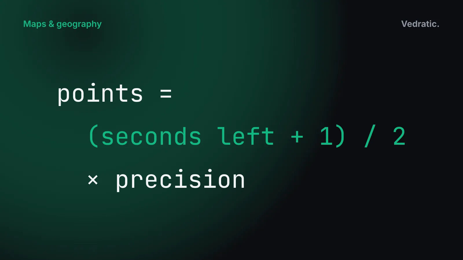
The second factor is time. The multiplier is (seconds left + 1) / 2, and the timer counts in fractions of a second, not whole seconds. On World Capitals’ normal mode, each round has 12 seconds:
- A perfect click the instant the map appears scores (12 + 1) / 2 × 100 = 650.
- A click 400 km off Cairo with 8 seconds left scores 4.5 × 80 = 360.
- The same click with 1 second left scores 1 × 80 = 80.
Precision and time multiply, so neither one works on its own. A fast click outside the threshold is still 0. A slow, careful click still scores something. We wanted the clock to reward knowing, not guessing quickly. A player who knows where Cairo is clicks early because they don’t need to search the map.
Route knowledge and survey knowledge
Research on spatial memory separates two kinds of knowledge, a distinction that goes back to Siegel and White (1975). Route knowledge is a sequence: turn left at the church, second right, straight on to the station. Survey knowledge is the overview: where things are relative to one another, the kind of knowledge a map gives you. You can have the first without the second. Follow the same route a few times with a phone giving directions and you may know every turn without being able to draw where the places are.
Two studies from University College London are often quoted about this.
- Maguire et al., 2000. The team compared structural MRI scans of 16 licensed London taxi drivers with those of control subjects who didn’t drive taxis. The drivers’ posterior hippocampi were larger, and a more anterior region was smaller. Hippocampal volume correlated with the time spent as a taxi driver: positively at the back, negatively at the front (PNAS 97(8): 4398–4403).
- Javadi et al., 2017. 24 participants navigated a simulation of London’s Soho during fMRI. When they entered a new street, activity in the right posterior hippocampus tracked how the number of onward connections changed. When a detour forced them to re-plan, prefrontal activity scaled with the planning demands. On control routes, where they were told which way to go at each junction, the hippocampal link to the street layout didn’t appear (Nature Communications 8: 14652).
Neither study looked at a game, and neither says what a game does to anyone’s brain. We don’t claim anything of the kind for Globdrop. Maguire’s result is a correlation between years of navigating London and the shape of the hippocampus. Javadi’s result is narrower and more useful for design: the hippocampal response to the street layout showed up when people chose their own way, and not when they were told which way to turn.
Globdrop is built around the overview. You get the whole map and no route. The target is placed relative to coastlines, borders and other places you know, and the error line shows your guess and the answer in the same view. That’s the design choice: feedback in the form of the map, not a list of steps.
What we fixed in September 2026
- The unit label. On the scenarios measured in miles (US States, Middle-earth, Westeros and One Piece), the top bar and the results screen said “km” for a number in miles. They say “mi” now.
- Distance on the world map. Globdrop used to measure your error on the flat image with one scale, and on the Miller world map that made an east–west miss at 60° N count about twice what it would at the Equator. Real-world maps are now measured on the globe. The projection still stretches the far north on screen, which we explain in How the Mercator projection changes the size of the world, but it no longer changes your score.
- The error line was meant to be dashed and came out solid, and very long lines stopped halfway. It’s dashed and complete now.
For some of the mistakes the error line tends to expose, and the research behind them, see Why your mental map is wrong. For how to get more out of the clock, see the strategy guide.